Introduction: Why CSS Grid and Flexbox Matter in Web Design?
Modern web development relies heavily on responsive and flexible layouts to provide a seamless user experience across devices. CSS Grid and Flexbox are two of the most powerful tools for web designers and developers.
They help in creating:
- Responsive layouts that adapt to different screen sizes
- Efficient page structures with minimal code
- Visually appealing designs without using unnecessary CSS hacks
- Better browser compatibility for cross-platform performance
While Grid is best for creating two-dimensional layouts (working in both rows and columns), Flex is perfect for one-dimensional layouts (either row-based or column-based).
In this in-depth guide, we will explore:
- Fundamentals of CSS Grid and Flex
- Step-by-step tutorials with code examples
- Advanced techniques for real-world applications
- Common mistakes to avoid when using Grid and Flex
By the end of this guide, you’ll have a strong understanding of how to use these CSS techniques to build stunning, responsive layouts for modern websites.
Understanding CSS Grid – A Two-Dimensional Layout System
What is CSS Grid?
CSS Grid is a layout system that allows you to create web page structures using rows and columns. It helps eliminate the need for floats, positioning hacks, and excessive nested divs.
Basic Syntax of CSS Grid
Here’s a simple example of how CSS Grid works:
<!DOCTYPE html>
<html lang="en">
<head>
    <meta charset="UTF-8">
    <meta name="viewport" content="width=device-width, initial-scale=1.0">
    <title>Simple CSS Grid Example</title>
    <style>
        .grid-container {
            display: grid;
            grid-template-columns: auto auto auto;
            gap: 10px;
            padding: 10px;
            background-color: #f4f4f4;
        }
        .grid-item {
            background-color: #fff;
            padding: 20px;
            text-align: center;
            border: 1px solid #ccc;
        }
    </style>
</head>
<body>

<div class="grid-container">
    <div class="grid-item">1</div>
    <div class="grid-item">2</div>
    <div class="grid-item">3</div>
    <div class="grid-item">4</div>
    <div class="grid-item">5</div>
    <div class="grid-item">6</div>
</div>

</body>
</html>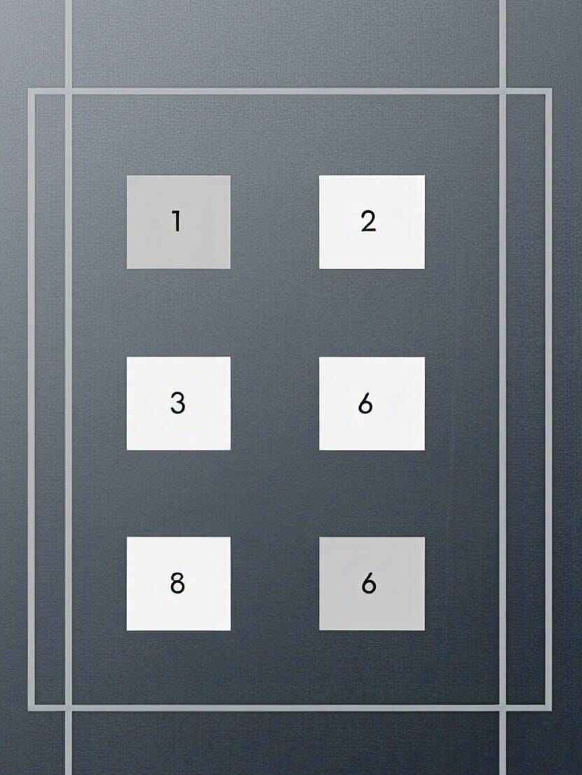
Explanation CSS grid code:
display: grid; turns the container into a grid layout.
grid-template-columns: auto auto auto; creates three columns.
gap: 10px; adds space between grid items.
Understanding Flexbox – A One-Dimensional Layout System
What is Flexbox?
Flexbox (Flexible Box) is a layout system designed for arranging items along a row or column. It provides better control over alignment, spacing, and responsiveness without using floats or positioning.
Basic Syntax of CSS Flexbox
Here’s a simple example of how Css Flexbox works:
<!DOCTYPE html>
<html lang="en">
<head>
    <meta charset="UTF-8">
    <meta name="viewport" content="width=device-width, initial-scale=1.0">
    <title>Flexbox Example</title>
    <style>
        .flex-container {
            display: flex;
            justify-content: space-around;
            background-color: #222;
            padding: 20px;
        }
        .flex-item {
            background-color: #fff;
            padding: 20px;
            text-align: center;
            width: 100px;
        }
    </style>
</head>
<body>

<div class="flex-container">
    <div class="flex-item">Item 1</div>
    <div class="flex-item">Item 2</div>
    <div class="flex-item">Item 3</div>
</div>

</body>
</html>
Explanation of css Flexbox code :
display: flex; enables Flexbox layout.
justify-content: space-around; evenly distributes items.
.flex-item { width: 100px; } keeps items equal-sized.
Combining CSS Grid & Flexbox – When and How to Use Each?
One of the most common questions developers have is:
“Should I use CSS Grid with Flexbox for my website layout?“
The answer depends on the structure and purpose of the elements you’re designing.
When to Use CSS Grid?
CSS Grid is best for two-dimensional layouts where you need both rows and columns.
✅ Use css Grid when:
- You’re creating a full-page layout.
- You need precise control over both rows & columns.
- You want elements to automatically adjust without needing extra media queries.
- You need to align items vertically and horizontally in a structured way.
Example: A Three-Column Layout Using CSS Grid
.container {
    display: grid;
    grid-template-columns: repeat(3, 1fr);
    gap: 20px;
}
.item {
    background: lightgray;
    padding: 20px;
    text-align: center;
}

<div class="container">
    <div class="item">Item 1</div>
    <div class="item">Item 2</div>
    <div class="item">Item 3</div>
</div>
When to Use CSS Flexbox?
Flexbox is ideal for one-dimensional layouts, either rows OR columns.
✅ Use Flexbox when:
- You need a simple row-based or column-based layout.
- You want to align items horizontally OR vertically.
- You want elements to automatically wrap when the screen size changes.
- You need equal spacing between items.
Example: A Responsive Navigation Bar Using CSS Flexbox
.navbar {
    display: flex;
    justify-content: space-between;
    background: #333;
    padding: 10px 20px;
}
.navbar a {
    color: white;
    text-decoration: none;
    padding: 10px;
}

<div class="navbar">
    <a href="#">Home</a>
    <a href="#">About</a>
    <a href="#">Services</a>
    <a href="#">Contact</a>
</div>
Combining Grid & Flexbox in a Single Layout
A modern website layout often requires both CSS Grid and Flexbox for the best performance.
- Use Grid for the overall page structure.
- Use Flexbox inside Grid elements for better content alignment.
Example: Grid for Page Layout, Flexbox for Navigation
.container {
    display: grid;
    grid-template-columns: 2fr 1fr;
    grid-template-rows: auto 1fr auto;
    gap: 20px;
}
header, footer {
    display: flex;
    justify-content: space-between;
    padding: 20px;
    background: #333;
    color: white;
}
.content {
    display: grid;
    grid-template-columns: repeat(3, 1fr);
    gap: 10px;
}
.sidebar {
    background: lightgray;
    padding: 20px;
}

<header>
    <div>Logo</div>
    <nav>Menu</nav>
</header>

<div class="container">
    <div class="content">
        <div>Article 1</div>
        <div>Article 2</div>
        <div>Article 3</div>
    </div>
    <aside class="sidebar">Sidebar Content</aside>
</div>

<footer>
    <p>Footer Content</p>
</footer>
Best Practices for Using Grid & Flexbox Together
- Use Grid for large-scale layout design (e.g., page sections).
- Use Flexbox for component-level layout (e.g., buttons, cards, navigation).
- Avoid using Grid inside Flexbox containers unless necessary.
- Keep Grid track sizes flexible (fr units) to make layouts responsive.
Creating a Complete Modern Web Layout Using CSS Grid and Flex
Now that we understand CSS Grid and Flexbox, let’s combine them to create a modern, fully responsive webpage layout. We’ll use CSS Grid for the overall structure and Flexbox for flexible content alignment inside sections.
Final Layout Structure:
Our layout will have:
- Header with a logo and navigation menu (Flexbox)
- Hero Section with a call-to-action (Flexbox)
- Three-column content section (CSS Grid)
- Sidebar for additional information (CSS Grid)
- Footer with social links (Flexbox)
Step 1: HTML Structure
<!DOCTYPE html>
<html lang="en">
<head>
    <meta charset="UTF-8">
    <meta name="viewport" content="width=device-width, initial-scale=1.0">
    <title>Modern CSS Grid & Flexbox Layout</title>
    <link rel="stylesheet" href="styles.css">
</head>
<body>

<header>
    <div class="logo">MyWebsite</div>
    <nav class="nav-menu">
        <ul>
            <li><a href="#">Home</a></li>
            <li><a href="#">About</a></li>
            <li><a href="#">Services</a></li>
            <li><a href="#">Contact</a></li>
        </ul>
    </nav>
</header>

<section class="hero">
    <h1>Welcome to Our Website</h1>
    <p>We build modern, responsive designs using CSS Grid & Flexbox.</p>
    <button>Get Started</button>
</section>

<div class="container">
    <main class="content">
        <article>Article 1</article>
        <article>Article 2</article>
        <article>Article 3</article>
    </main>
    <aside class="sidebar">
        <h2>Sidebar</h2>
        <p>Additional content here.</p>
    </aside>
</div>

<footer>
    <p>© 2025 MyWebsite. All rights reserved.</p>
</footer>

</body>
</html>
Step 2: CSS Styling
* {
    margin: 0;
    padding: 0;
    box-sizing: border-box;
}

body {
    font-family: Arial, sans-serif;
    line-height: 1.6;
}

header {
    display: flex;
    justify-content: space-between;
    align-items: center;
    background: #333;
    color: white;
    padding: 20px;
}

.nav-menu ul {
    list-style: none;
    display: flex;
}

.nav-menu li {
    margin: 0 10px;
}

.nav-menu a {
    color: white;
    text-decoration: none;
}

.hero {
    text-align: center;
    padding: 50px;
    background: #f4f4f4;
}

.container {
    display: grid;
    grid-template-columns: 2fr 1fr;
    gap: 20px;
    padding: 20px;
}

.content {
    display: grid;
    grid-template-columns: repeat(3, 1fr);
    gap: 15px;
}

.sidebar {
    background: #ddd;
    padding: 20px;
}

footer {
    text-align: center;
    padding: 20px;
    background: #333;
    color: white;
}
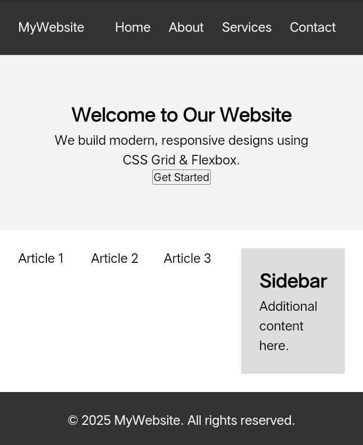
Explanation:
- Flexbox in Header: Aligns logo and navigation menu in one row.
- Flexbox in Hero Section: Centers the text and button horizontally.
- CSS Grid in Content Section: Creates a three-column layout for articles.
- CSS Grid in Container: Defines the main-content and sidebar layout.
- Flexbox in Footer: Centers the copyright text.
IF You Like CSS Then Check My Css gredient generator tool online
People Also Ask questions:
CSS Grid is a two-dimensional layout system that allows you to control both rows and columns, while Flexbox is a one-dimensional system that works in either a row or a column. Use CSS Grid for complex layouts and Flexbox for simpler, single-direction layouts.
To create a responsive layout, use grid-template-columns: repeat(auto-fit, minmax(200px, 1fr)); in CSS Grid to adjust column sizes dynamically. For Flexbox, use flex-wrap: wrap; to make items wrap on smaller screens.
Flexbox provides alignment properties like justify-content: center; to center items horizontally and align-items: center; to center them vertically. Use space-between, space-around, or space-evenly for even spacing between elements.
Both CSS Grid and Flexbox have minimal direct impact on SEO. However, using semantic HTML, reducing unnecessary elements, and optimizing CSS can improve performance. Flexbox is generally faster for simple layouts, while Grid is better for complex structures.
Yes, CSS Grid and Flexbox can be combined. For example, you can use a Grid layout for the main page structure and Flexbox for aligning elements inside grid items. This approach helps create flexible and responsive designs.
-
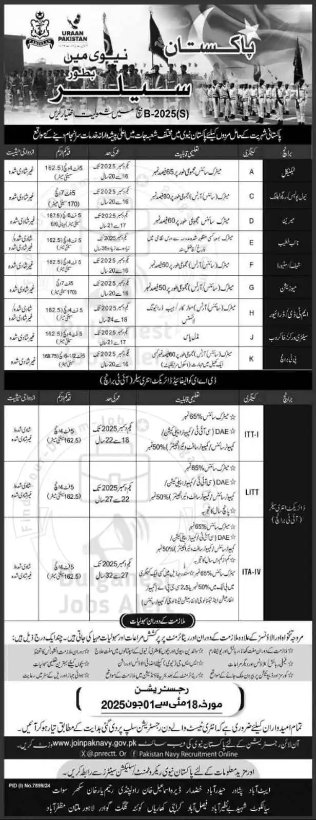
Join Pakistan Navy 2025 as Sailor – B-2025(S) Batch Recruitment
Join Pakistan Navy 2025 Introduction: The Pakistan Navy invites applications from ambitious and patriotic individuals across the country to be […]
-

Pakistan Army Second Lieutenant Jobs 2025: PMA Long Course Guide
Are you aspiring to serve as a Second Lieutenant in the Pakistan Army? The Pakistan Army Second Lieutenant Jobs PMA […]
-
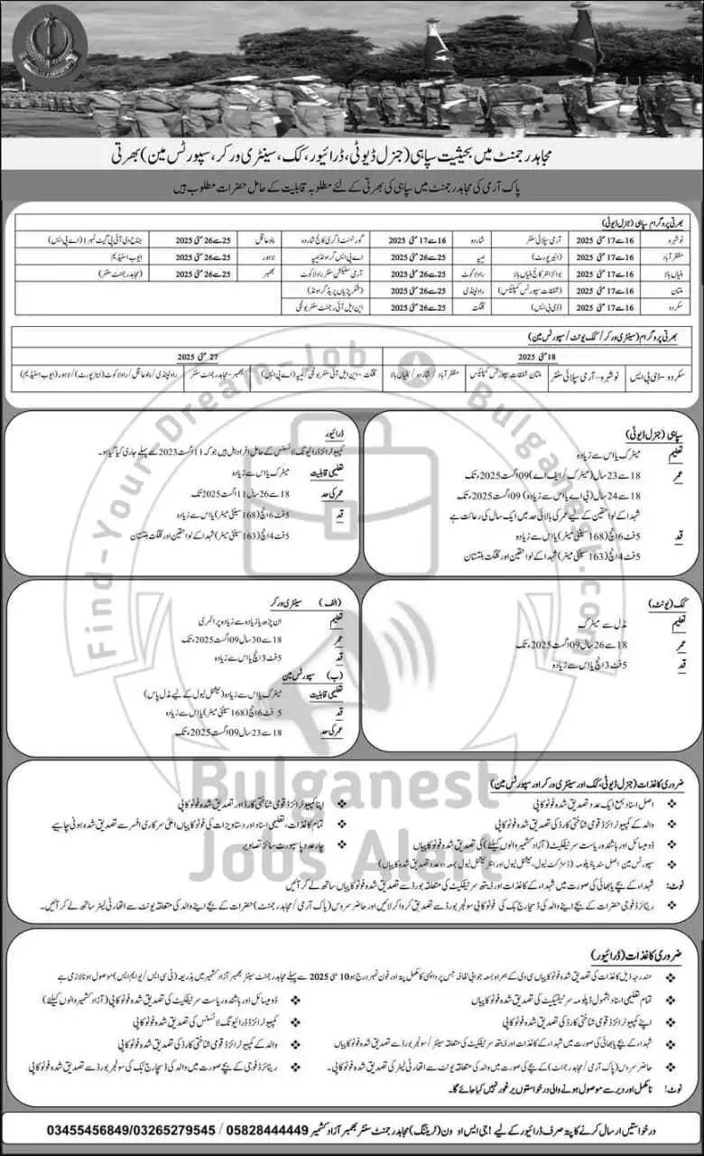
Join Pakistan Army Mujahid Force Jobs 2025 – Apply Now
Overview Are you passionate about serving your country? Do you dream of wearing the uniform of honor and dignity? If […]
-
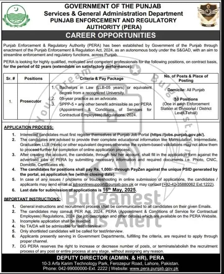
PERA Prosecutor Jobs 2025 – Apply Online Complete Guidelines
PERA Prosecutor Jobs 2025 – Complete Application Guide The Government of Punjab has officially announced PERA Prosecutor Jobs 2025 under […]