Introduction
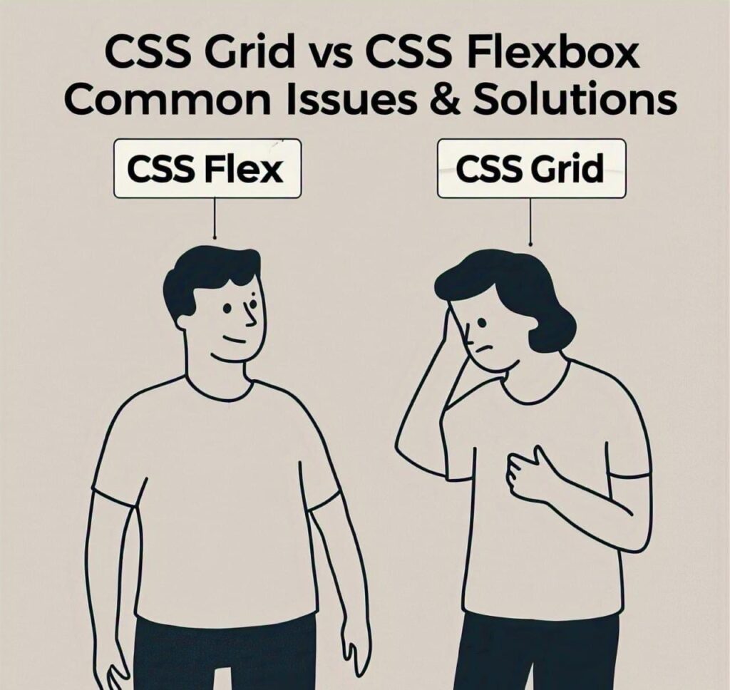
In today’s web development landscape, CSS Grid and Flexbox are essential tools that every developer must master. These layout systems are incredibly powerful, enabling developers to create responsive, adaptive, and complex web layouts without relying on external frameworks. While they offer immense flexibility, developers often face hurdles such as alignment issues, overflow problems, and improper sizing. This can lead to frustrating layout problems, especially for beginners. Below are some common CSS Grid and flexbox issues discussed with proper code solutions.
What’s the Difference Between CSS Grid and Flexbox?
CSS Grid: Ideal for two-dimensional layouts, allowing you to control both columns and rows simultaneously.
Flexbox: Best suited for one-dimensional layouts, whether you need to align items horizontally or vertically.
Though both systems are intuitive, they are not without their challenges. If you’ve ever experienced issues like content stretching too far, items not aligning correctly, or unexpected gaps, you’re not alone. These problems are common but solvable with the right techniques.
In this article, we’ll tackle 19 of the most common CSS Grid and Flexbox issues and provide actionable solutions with code examples. Whether you’re just starting out or have years of experience, you’ll walk away with solutions that you can implement right away.
By the end of this post, you’ll have a deeper understanding of CSS Grid and Flexbox and be well-equipped to handle layout problems confidently. If you want to know more about CSS Flex and CSS grid in detail, you can get complete knowledge from my 2nd articles. CSS grid and flexbox complete knowledge
Top 19 CSS Layout Problems (Grid & Flexbox) with Solutions
1. Elements Not Aligning Properly using CSS grid and Flexbox
Properly One of the most common problems when using Flexbox or CSS Grid is elements not aligning properly within the container. This often occurs when the developer hasn’t properly set the alignment properties.
Solution of Elements Not Aligning properly:
.container { display: flex;
justify-content: center; /* Aligns items horizontally */
align-items: center; /* Aligns items vertically */}
For Grid, the solution is similar:
.container { display: grid; justify-items: center; /* Align items horizontally */
align-items: center; /* Align items vertically */}These properties ensure that the items are aligned both horizontally and vertically in their container.---
2. Items Not Wrapping Correctly
With Flexbox, when items don’t wrap correctly, it can result in layout issues, particularly on smaller screens.
Items Not Wrapping Correctly Solution with code:
.container { display: flex; flex-wrap: wrap;}
This allows items to wrap onto the next line when the container becomes too narrow.---
3. CSS Flex Items Are Too Big or Too Small
If flex items appear too big or small, it’s likely because you’re not using the flex-grow, flex-shrink, or flex-basis properties properly.
Solution of Flex Items Are Too Big or Too Small with code:
.item { flex: 1 1 200px; /* flex-grow | flex-shrink | flex-basis */}This makes sure each item grows to take available space but doesn’t shrink below a specific size.---4. Unexpected Gaps Between Items
Gaps between flex items can appear when margins are not properly controlled, or gap property is not used chek solution code for understanding.
Solution Unexpected Gaps Between Items with example code:
.container { display: flex; gap: 20px; /* Creates uniform spacing between items */}For Grid layouts, use grid-gap to set gaps between rows and columns.---5. Items Stretching in the Wrong Direction in CSS grid and Flexbox
Flex items can stretch out in the wrong direction if align-items or align-self properties aren’t used correctly.
Solution of Items Stretching in the Wrong Direction:
.container { display: flex; align-items: flex-start; /* Aligns items at the top of the container */}This prevents the items from stretching vertically inappropriately.---6. Flexbox Doesn’t Work with position: absolute Elements
Flexbox doesn’t work well with position: absolute elements because absolute positioning removes the element from the document flow.
Solution of Flexbox Doesn’t Work with position: absolute Elements:
Ensure that absolute elements are positioned within the relative container:
.container { position: relative;}.absolute-item { position: absolute; top: 0; left: 0;}---
7. Items Overlapping
Items may overlap if there’s not enough space for them to fit within the container.
Solution code of Items Overlapping:
Use flex-wrap to allow items to wrap onto a new line, or adjust the container's width and margins.---8. Using CSS Flex on Non-Flex Containers
You can’t apply Flexbox on containers that don’t have the display: flex or display: inline-flex property.
Solution example Using Flex on Non-Flex Containers:
Make sure to add display: flex to your container:.container { display: flex;}---9. Multiple Rows or Columns Issues
In both Flexbox and CSS Grid, handling multiple rows or columns can be tricky if the layout properties are not set correctly.
Solution Multiple Rows or Columns Issues with code:
.container { display: flex; flex-wrap: wrap;}
For Grid:
.container { display: grid; grid-template-columns: repeat(3, 1fr); /* 3 columns */}---
10. CSS Flex Item Not Taking Available Space
Sometimes flex items don’t take the available space if flex-grow is not properly set.
Solution code of Flex Item Not Taking Available Space:
.item { flex-grow: 1; /* Allows the item to grow and fill the available space */}Conclusion of CSS Grid and Flexbox:
Understanding and mastering CSS Grid and Flexbox is essential for any modern web developer. While these layout systems are incredibly powerful, it’s common to face challenges when using them. By following the solutions outlined in this article, you can avoid the most common pitfalls and create robust, flexible layouts that work across devices and screen sizes.
Do you still face issues or have any questions related to Flexbox or CSS Grid? Feel free to drop your questions in the comments below, and I’ll help you with more tailored solutions. If you found this article useful, share it with your fellow developers and help them solve their layout issues too!
People’s Also Ask Questions About CSS grid and Flexbox Issues
Implicit rows are automatically created by the browser when there are more grid items than defined rows. To avoid layout issues, define rows using grid-template-rows or use grid-auto-rows to set a default size for implicit rows. You can also control flow with grid-auto-flow.
flex: 1 is shorthand for flex-grow: 1; flex-shrink: 1; flex-basis: 0%. It allows the flex item to grow and shrink as needed, sharing available space equally with other items that also use flex: 1. It’s useful for responsive designs.
CSS Grid is a two-dimensional layout system (rows and columns), best for complex layouts. Flexbox is one-dimensional (row or column), ideal for simpler layouts like navbars or horizontal/vertical lists. Use Grid when you need full control over both axes.
Use justify-content: center; to center items along the main axis, and align-items: center; to center them along the cross axis. This is a common technique to perfectly center content both horizontally and vertically inside a flex container.
Layouts often break due to fixed widths, lack of media queries, or improper use of min-width, max-width, or flex-wrap. To fix this, make sure to use responsive units (%, vw, em), wrap flex items using flex-wrap: wrap;, and apply media queries for different screen sizes.
Read My Other Post’s
-

Join Pakistan Navy 2025 as Sailor – B-2025(S) Batch Recruitment
Join Pakistan Navy 2025 Introduction: The Pakistan Navy invites applications from ambitious and patriotic individuals across the country to be […]
-

Pakistan Army Second Lieutenant Jobs 2025: PMA Long Course Guide
Are you aspiring to serve as a Second Lieutenant in the Pakistan Army? The Pakistan Army Second Lieutenant Jobs PMA […]
-

Join Pakistan Army Mujahid Force Jobs 2025 – Apply Now
Overview Are you passionate about serving your country? Do you dream of wearing the uniform of honor and dignity? If […]
-

PERA Prosecutor Jobs 2025 – Apply Online Complete Guidelines
PERA Prosecutor Jobs 2025 – Complete Application Guide The Government of Punjab has officially announced PERA Prosecutor Jobs 2025 under […]
-

AirSial Cabin Crew Jobs 2025 – Online Apply & Requirements
AirSial Cabin Crew Jobs 2025 Overview If you are a young, confident, and well-groomed female looking for a career in […]